Shanghai
Jiahui Health
Brand Refresh
Scroll ↓
Jiahui Health
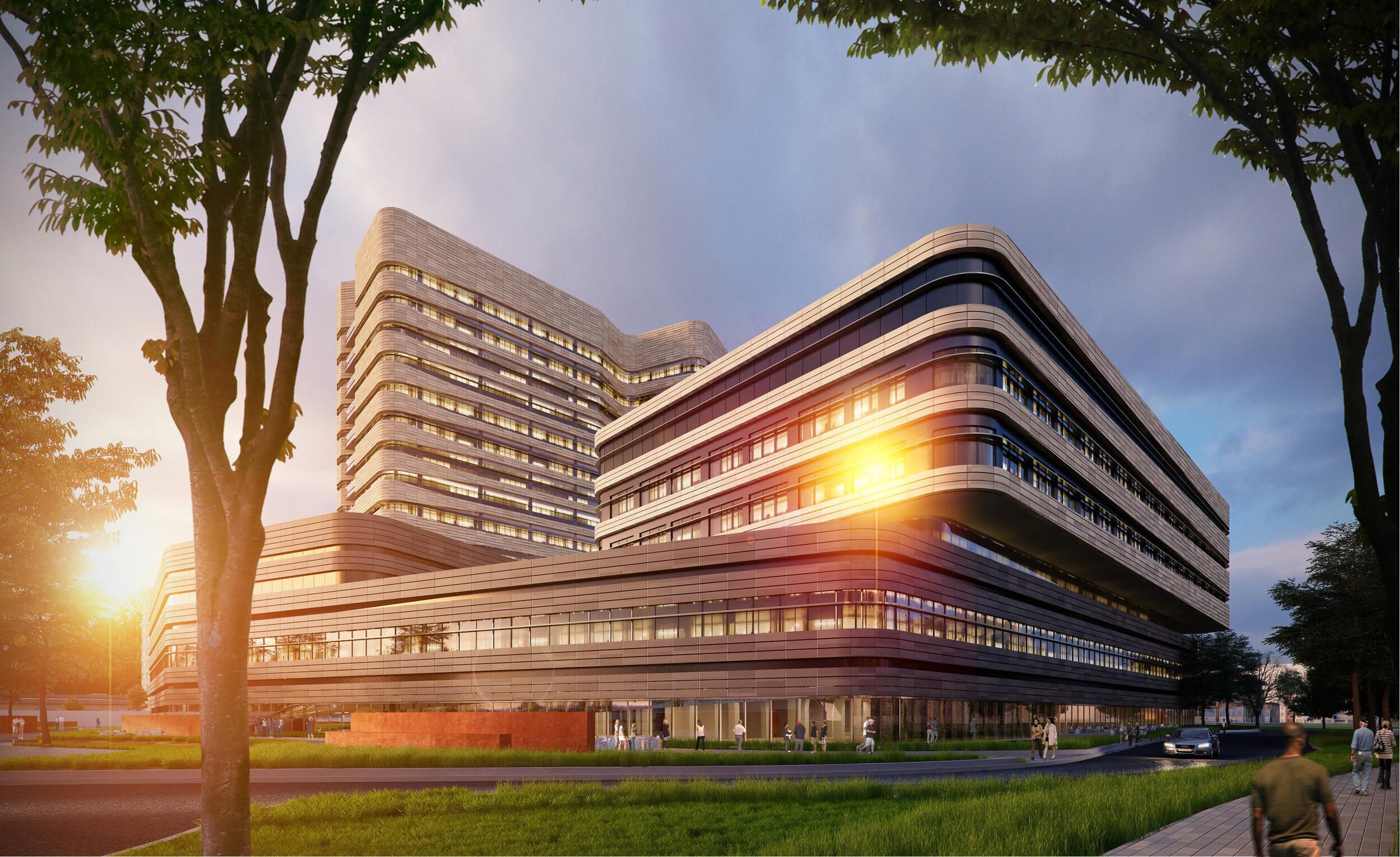
In 2009, Jiahui Health was established in Shanghai. After eight years of development, Jiahui International Hospital became China's first Sino-foreign joint venture integrated medical and health ecosystem. It includes Jiahui Clinic for outpatient care, Jiahui International Hospital for tertiary care, and Jiahui Wellness for health management, providing a full spectrum of personalized care, convenience, and quality healthcare services.
With the rapid expansion of Jiahui Health in the Chinese healthcare landscape, the original brand image could not reflect their strengths and missions, and its needs to drive relevance across a broad set of stakeholders including patients, employees and healthcare partners.
How to:
Differentiate Jiahui Health as an innovative, quality and responsible healthcare provider and win the trust of Chinese consumers when they are disillusioned with public healthcare and feel that private healthcare services are exorbitantly priced?
Hence:
A new creative brand expression to fully communicate its extraordinary value and truly unique positioning in the Chinese healthcare market across a broad set of stakeholders including patients, employees and healthcare partners was created.

New identity
Following the refresh of the bilingual logo and its horizontal and vertical lock-ups, we proceeded to creating new patterns, business cards, stationery, brochure, photography style and brand guidelines including key visuals, avoiding bleak and sterile imagery, focussing on the most intimate and important moments for everyone, evoking emotions of care and authenticity.


Addressing the inconsistency of the department logos – out of the 6 departments, there were only 4 departments with bilingual lock-up and all 6 departments were in English only.

Previous English logotype - DIN

Gill Sans was selected for its new logotype as it is a humanistic sans serif family that been used in virtually every country and in nearly every application imaginable.

Previous Chinese logotype

A new Chinese typeface was selected – corners and strokes were refined and made rounder and smoother
to depict exclusivity and quality for its new Chinese logotype.

Previous color palette

New color palette
A lighter color palette – suggesting care, respect and the quality healthcare service Jiahui Health provides, was proposed. Jiahui Medical Center and Jiahui Clinic were using the same color (purple); to avoid confusion and address operation needs, different purple for the 2 departments were proposed.
Jiahui Health Identity – Before

Jiahui Health Identity – After

Department Logos (Horizontal Lockup) – Before

Department Logos (Horizontal Lockup) – After

Department Logos (Vertical Lockup) – Before

Department Logos (Vertical Lockup) – After

The combination of the logomark and logotype in its respective colors inspires higher ideals, symbolizes care, respect, trust, and understanding.
Previous patterns were too busy and heavy, do not communicate friendliness
New patterns portray care and respect for people and also symbolizes well-being for everyone, strengthening the value of Jiahui and a lifetime of care for the sick and advocate leading healthier lives, and empowering those with the heart to serve.


Business Card

Letterhead

Envelope

Key Visual


Brand Guidelines for Jiahui Health and its departments

Photography style

Logo usage

Key visual format
With its new brand identity in place to unite and inspire its people from overall planning to daily operations,
Jiahui Health is committed to fostering an environment with personalized care and highly efficient operations.